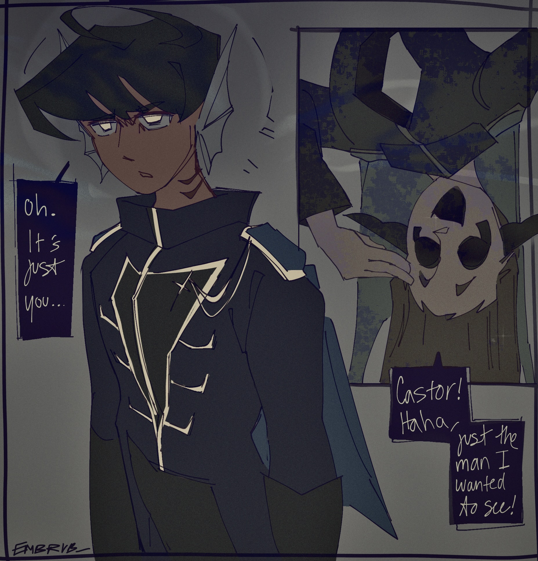
You Again
creation date: early april
character featured: enzo & archer
k so. while the isra hbd portrait was a style test for illustration, i was tryinta see what a panel of a comic might look like if drawn very loosely here. like, ive done comics in this program before, but i wanted to find a style that'd allow me to finish panels *quickly* ...cos the older sequential stuff ive done in ibis before (i.e. BOCT) - they were very pretty but they took wayyyyyy too long to do. like. dont even talk to me.
as for this piece's function as a style test, it kinda failed tbh LOL. i do not like the style of this thing x-x
i was going for a messy lineart, v angular, limited undos type of thing? but the anatomy of the characters looks *off* to me because of it? the shapes aren't the type i would normally like to see in a comic of mine? too long & skinny & rectangular if that makes any sense. i dunno, just seems endlessly off for reasons i cannot articulate, but that's ok, cos now i know what to avoid at all costs next time. BRO i couldn't even nail the color scheme, i had to put so many damn filters on this thing to finally be satisfied guhhh
archer looks alright though, all things considered. what a silly guy.