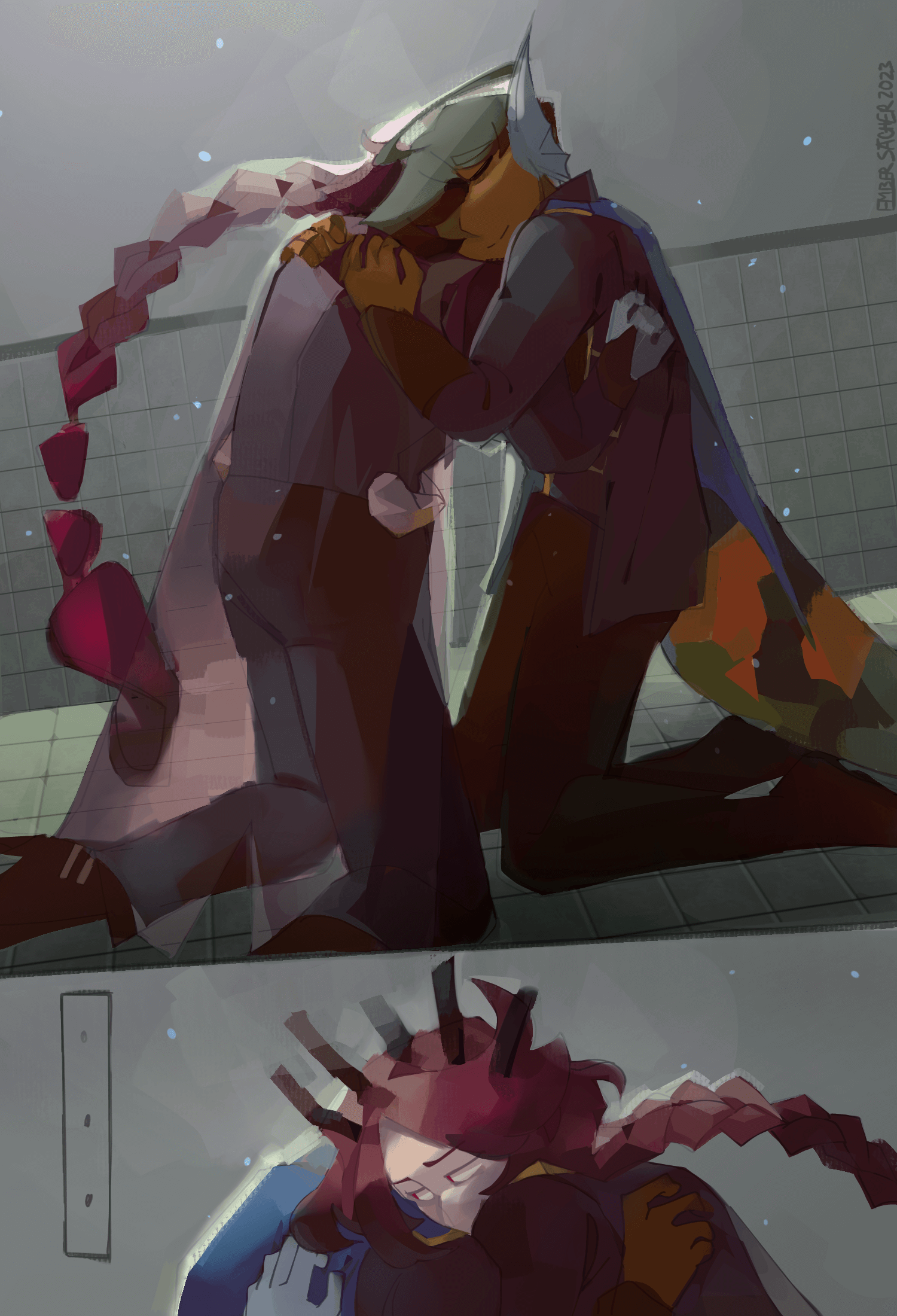
.png)
light
creation date: july 31, finished: august 25
characters featured: otis & enzo :3
in which i let the emotionally repressed freaks hug once. once. /p /p /p /p
i frequently go back and forth between enthusiastically praising this piece and throwing my phone at the wall out of agitation at this piece. i don't know why. but i get so embarrassed with this one. i don't know man. they;re hugging and the title is a reference to a corny-ass song about friendship and it's a drawing of a corny-ass scene of two sad mfs embracing and when i thihnk abt it. i don't know. i'm so sappy abt it. it makes me very giddy and very shut the FUCK up. SHUT THE FUCK UP.
maybe i'm the only emotionally repressed freak here smh,
anyways, art talk.
after the incredible indecision and frustration that was jun-jul's art journey, something finally clicked in this piece and i hit the ground running. somethingsomething, it gets worse before it gets better, something.... actually, now that i think about it, im p sure the only thing significantly different in THIS process than my previous processes is that... i used a color sketch for this one. i actually blocked out my colors and didn't go straight to flats this time........ despite how long this piece took (25 hours across 26 days), this is the easiest i've ever had coloring and shading a piece. bc of the tiniest bit of extra planning, who woulda thought.
so. i think this is my favorite piece i've ever done in ibis. 2nd overall favorite artwork of mine ever (2nd to that one kairos intermission card),, and i 100% understand how wonky the anatomy is and uhh,, something something the angle of the whole thing is maybe wrong,, but oUGGHHHHRGRRR the blotches of bounce light looks REAL tasty imo, and im savoring it sm because i've never been able to replicate something like it before. little things like otis's cape actually looking transparent (like a sheet of ice woa) and changing the colors under it, the orange undertones and the blue secondary lighting meshing subtly with it. the warm purples and browns and warm everything UGH it looks so COZY. guhhhh. im never gonna b able to suck my own cock this hard again idk when im gonna top this one.
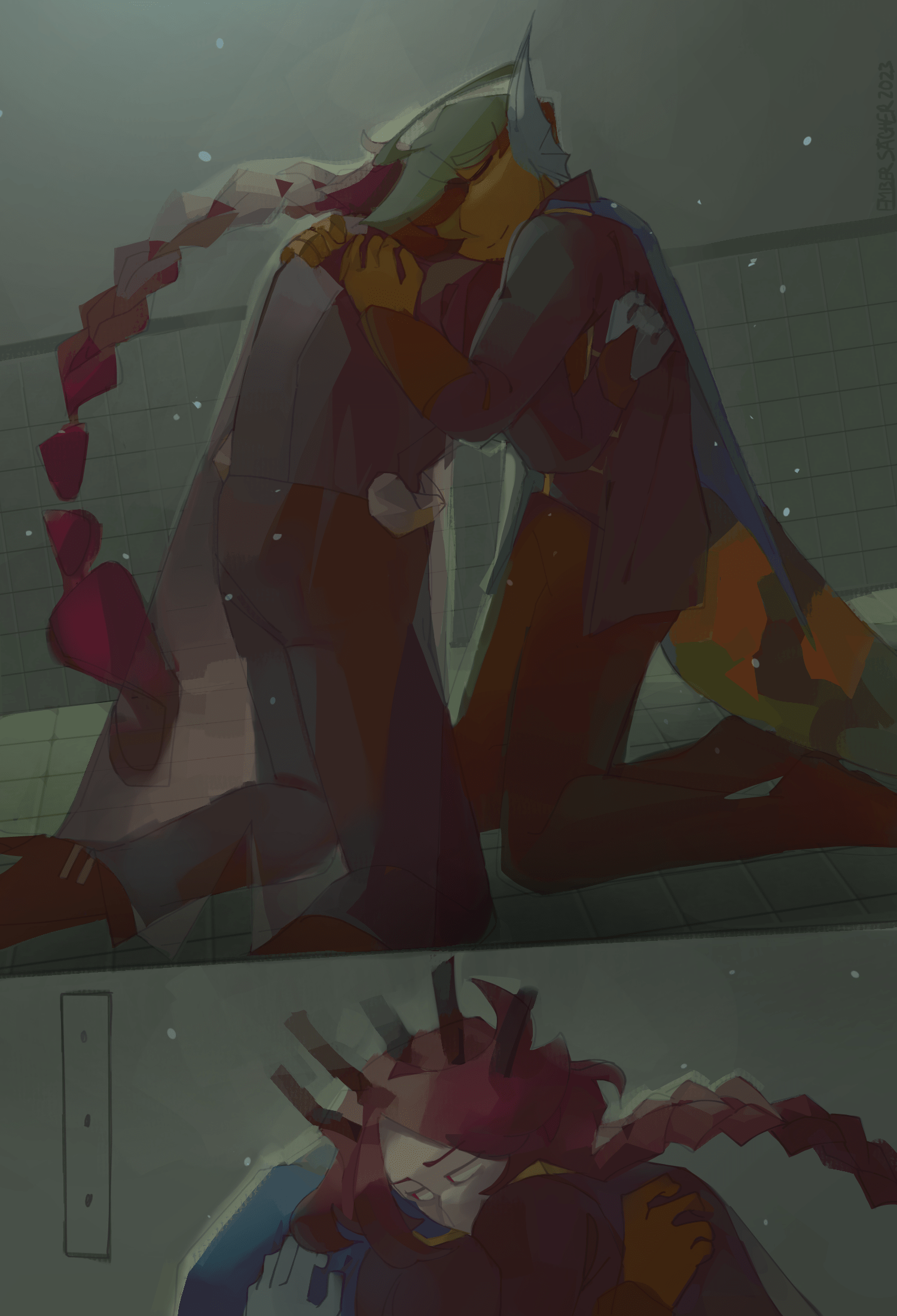
also heres some alt color versions, idk


yea