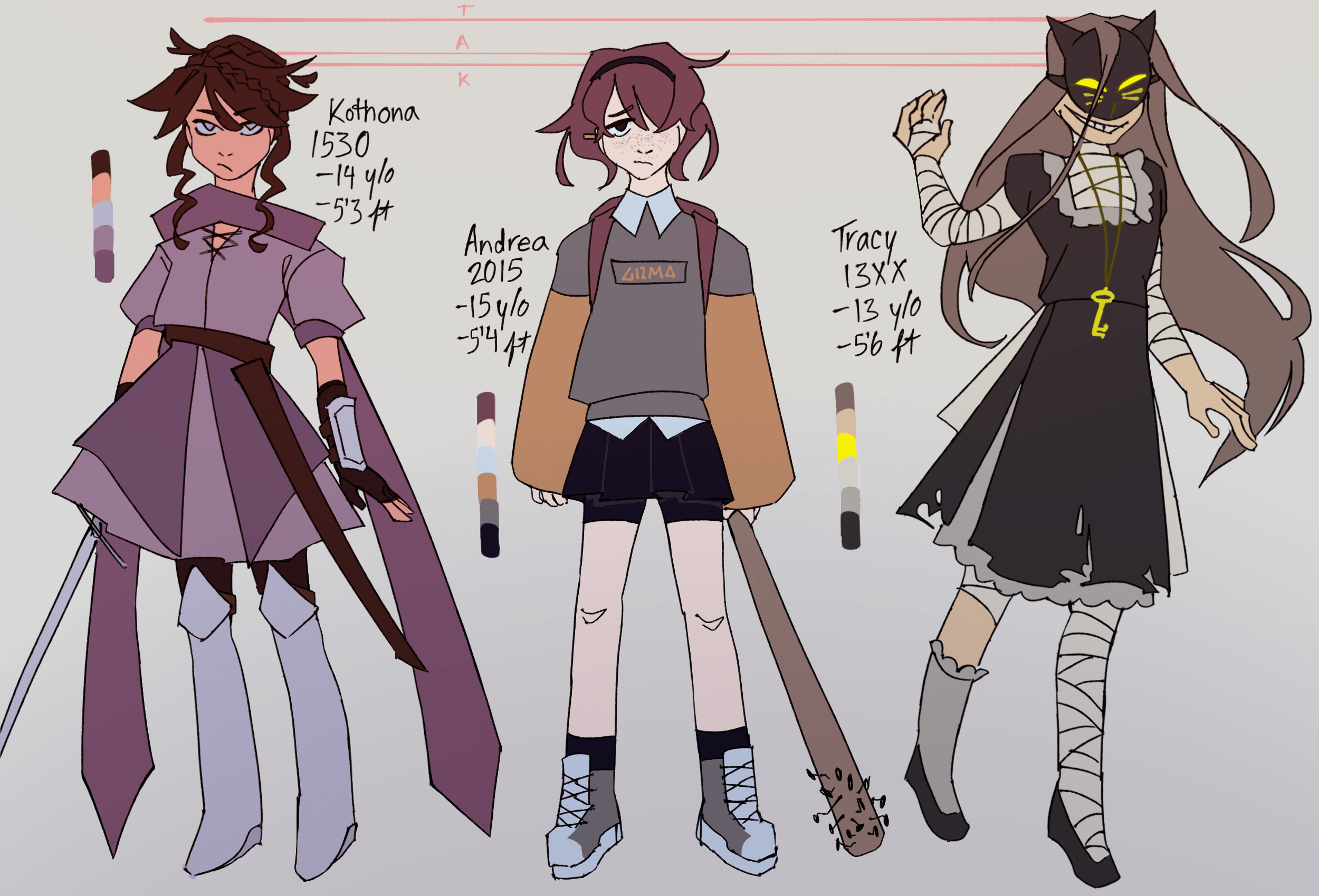
kothona reference sheet
creation date: june 23
characters featured: [left to right] kothona, andrea, tracy
nothing much to say about these artistically actually. i made this ref sheet for artfight and ended up redesigning them a tad.
im p happy with em, except kothona's design is the only one i feel abit iffy about........ i think she ended up looking boring in comparison to the others. tbf she looked a lot more complex as i was doing the lineart- i think her character is recognizable from her silhouette/shapes but the colors man.. i dont know what to add to make it pop more, bc i SWEAR it's missing something.
i'll probably reminisce on it for abit.